Carnegie Mellon
International Film Festival
Redesigning a Film Archive: Where Culture Meets Accessibility, from Screenings to Screens


How might we increase attendees’ awareness of the festival’s multicultural emphasis and showcase film screenings in an engaging way?
Team
Srishty Bhavsar, Jennifer Kim, Teresa Yang, Julianna Bolovar, Graana Khan
Role
UI/UX Designer and Research Lead
Tools
Figma, Figjam, Adobe Creative Suites, Three.js, Globe.js
Duration
12 weeks
Individual: `3 weeks
Class
BHCI Capstone - Carnegie Mellon
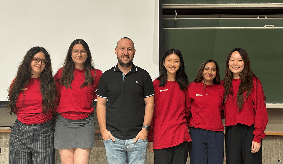
My Capstone team along with our industry advisor
Design Solution
The new CMU IFF archival website redesign prioritizes a clean and easy to navigate interface that is engaging, and supports the exploration of different cultures.
A. The CMU IFF Homepage showcases a cinematic landing page design with a translucent navigation bar and immersive trailer preview. As users scroll, they are invited to explore the interactive globe or the general film catalog.
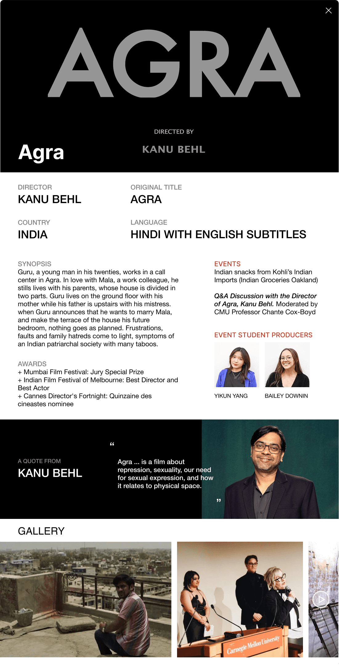
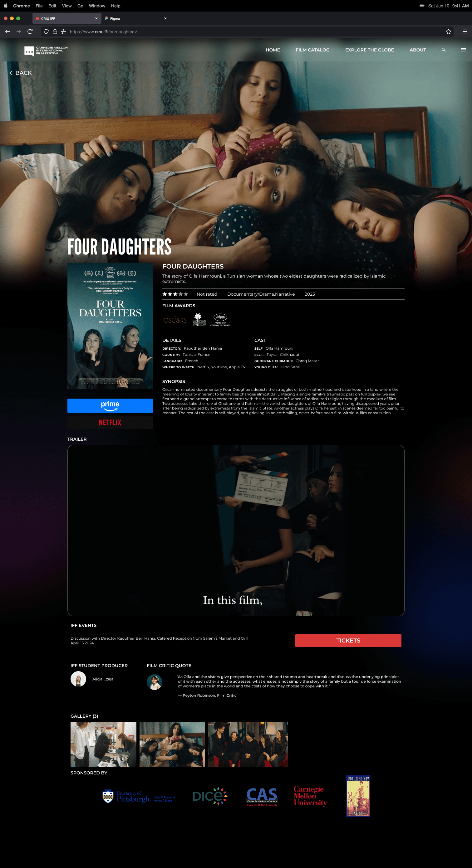
B. Each film has its own unique detail page showcasing important summaries about the film, its trailer, intern spotlights, and screening information.
C. The Interactive Globe allows users to randomize their film exploration experience and visit the film catalog page of a country that they land on. Users have the option to stay on the existing landing page and explore the general film catalog or exit to the randomized country film page.
D. Like an archive, users have access to the general film catalog, which hosts every film that was showcased from the past festivals. The film catalog can show personalized results(based on genre, country, and more) through the filter functionality.
About
Imagine attending a film festival that celebrates global cultures, only to find its website lacks the vibrancy and accessibility of the event itself. You would probably lose interest.
This was the reality for attendees of Carnegie Mellon's International Film Festival, where the online archive failed to capture the festival's essence. CMU IFF is the only international film festival in the world that is organized and run by students from different universities. Their mission is to engage Pittsburgh with a festival that promotes cultural exchange and expression through the medium of film.

Clients and stakeholders


Problem
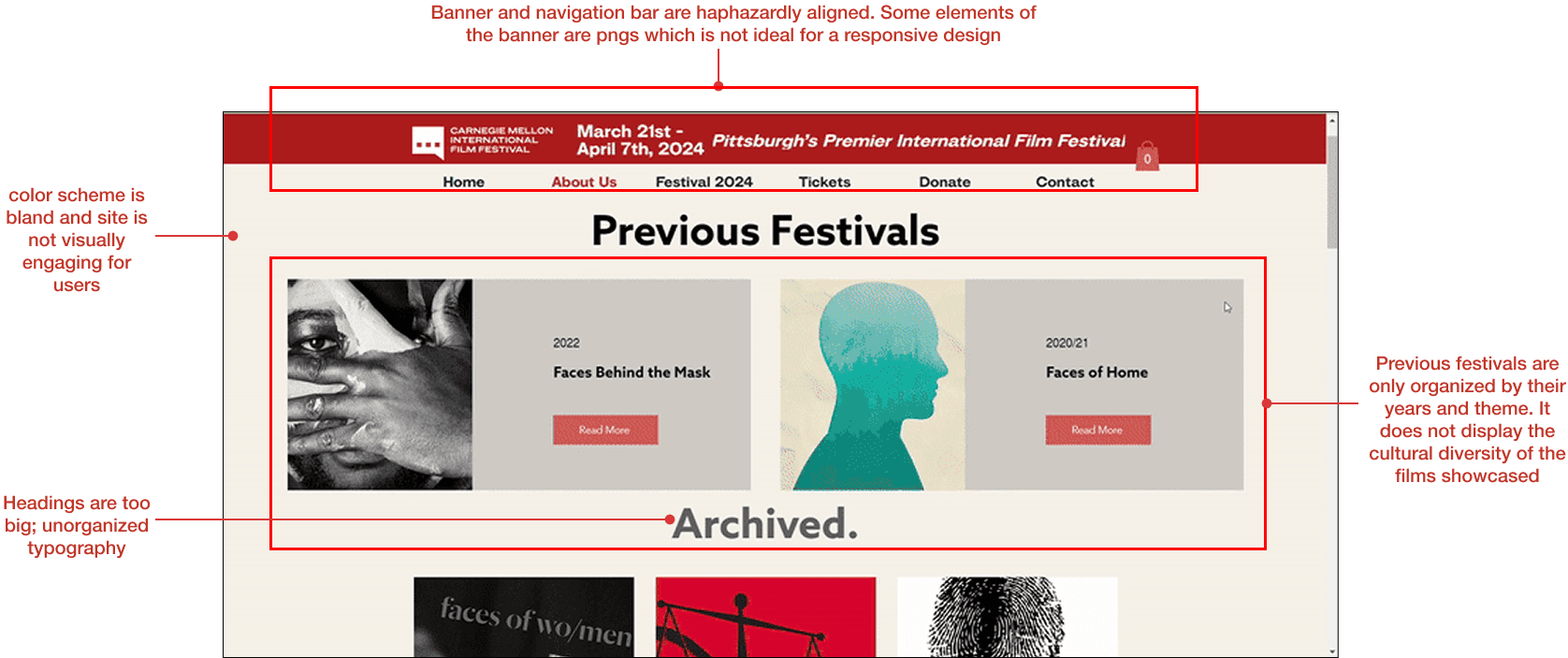
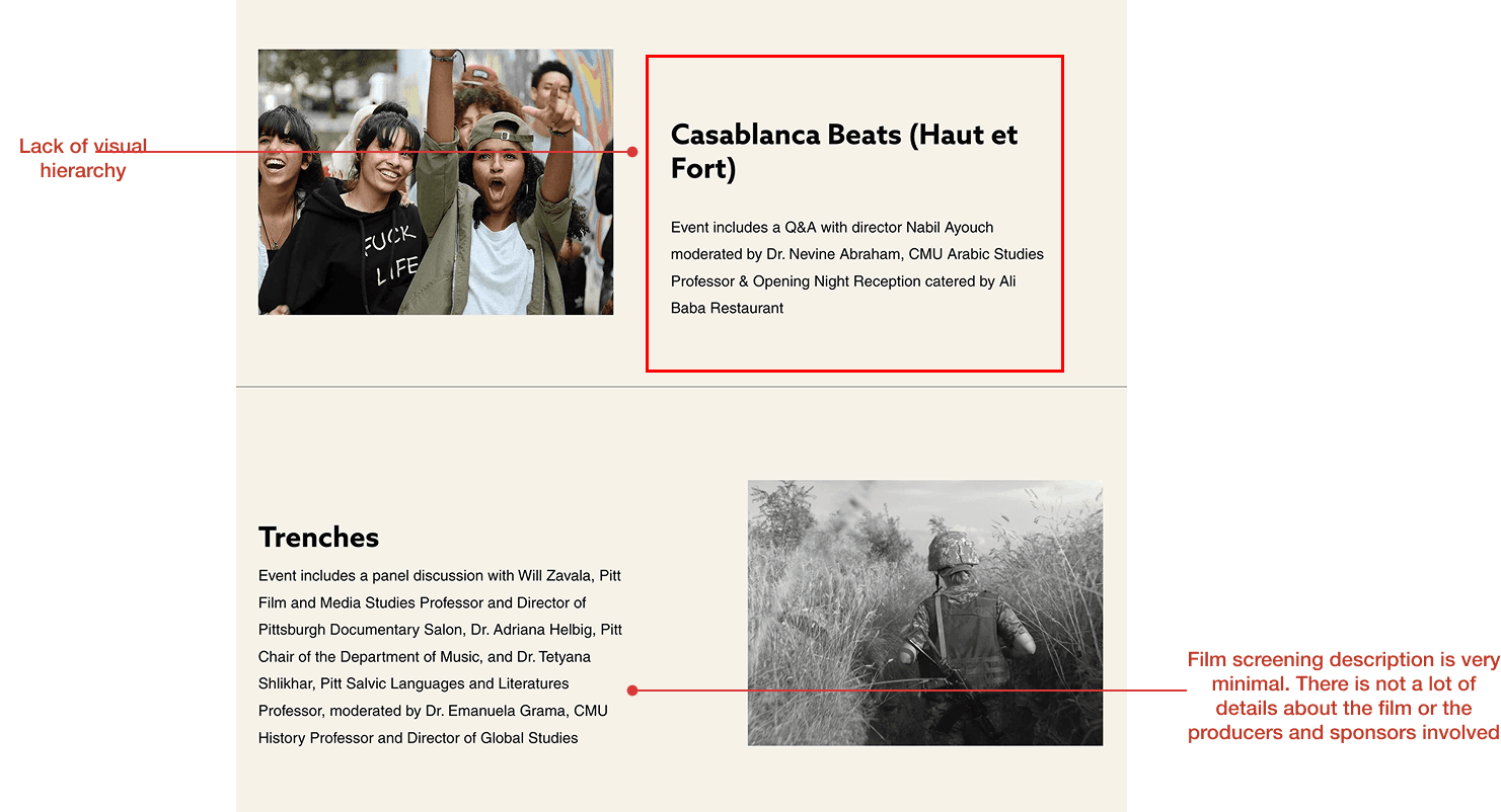
CMU IFF's current archival website is not intuitive, engaging, or organized well to capture its multicultural identity.
When interviewing Carnegie Mellon students who attended past festivals, we utilized a think-aloud protocol in our interviews to analyze their experience with the archive interface. This allowed us to identify major pain points regarding the website's design and ideate possible opportunities for improvement. Below are a few of the heuristic markups we conducted on the site.
Comparative Analysis
Through a comparative analysis, we were able to address the strengths and weaknesses of the current CMU IFF site in relation to other similar sites in the film, cinema, and events market. We learned that each site prioritized a bold and eye catching home page as well as organized layouts and hierarchy in typography.

Read More about Comparative Analysis
Research
The focus of our research phase was to discover who the target audience of the digital archive was, and their motivations in using it.
1
How can the identity of the film festival and those involved be represented in an archive?
2
How do you create intrigue circulating the archive and festival?
3
Which stakeholder would benefit the most from an archive?
Target Audience
Our 8 interviews with student interns, attendees, staff, and sponsors allowed us to understand the range insights related to the importance of the CMU IFF archive. For the scope of our project, we decided to focus on attendees as our target audience because we believed that the archive served as the greatest tool for them to be drawn to the festival.


Insights
“I don’t want to be self centered or arrogant. The film festival provides a window into other cultures, their problems, their solutions, and how their lives are”
- Attendee
Attendees appreciate the opportunity to challenge their beliefs through exposure to the festival’s curated and diverse selection of films.
Attendees find value in the festival’s educational and cultural themes, and believe that this sets the IFF apart and makes it unique.
ideation
We brainstormed countless design solutions on how to make the digital archive an engaging source for attendees to learn about the festival.
Methodology
Using methods such as reverse assumptions, storyboarding, and crazy 8s, we were able to generate numerous ideas that were not restricted just to a digital archive. This allowed us to pursue ideas of gamification, interactivity, and advertisement.

Digital prototypes
Because we knew that cultural exploration was an important value to attendees, we ideated upon a low fidelity digital archive interface in which a user spins a globe to arrive on a random country's featured film screenings. The digital archive homepage was redesigned to showcase films under their festival year in order to create a more visually engaging layout.

Physical Booth Ideation
Inspired by the energy of film festivals and museum installations, we explored the idea of a physical booth, an interactive pop-up where attendees could browse the archive, leave reflections, and celebrate past festivals in real time. We believed that through this physical booth, attendees could find information about IFF not only through their archive website but also through the university center.


Physical scale models of interactive spaces built with paper by Graana Khan
Testing
“The internationality of [these films] makes you empathize with other situations that are very different from us... it’s the highest value the festival gives.”- Attendee
When the festival came around, it wasn't feasible to design an entire physical booth like we had originally decided upon. Thus we made use of a make-shift laptop booth and invited attendees in line to engage with the prototype. We quickly learned that the entry process was fast, and most attendees arrived just before showtime so the interest in the booth was minimal.

Users want more autonomy and personalization in what they view
Users are not likely to interact with a physical booth
Users enjoy the element of randomness
Users want to quickly glance at a film, if browsing
Users tend to scroll past big blocks of information
Final Design Revisions
High Fidelity prototype
Our final design of the capstone project was was supported by contextual details like region filters, past event highlights, and intern spotlights.
This prototype organized films systematically through year and allowed attendees to search through the featured films through a filtered system. Our globe feature was additionally redesigned to feature as a pop up that appeared on the home page, allowing attendees to be more drawn to randomly explore a new country. Each feature has been thoroughly explained through the slides below.


Final revisons
Though the course had ended, I wanted to tweak the final UI design of the final product to read as more visually cinematic and futuristic.

Inspiration
Our final design product was very good at the touch points of personalized searching, cultural exploration, and organization of films. However, I did think that it could be improved to read visually as more cohesive, bold, and immersive. As I explored sites such as Netflix, Criterion collection, AMC, I was inspired by their futuristic font styles, bold colors, and overall "cinematic" feel.


Visual Design Elements
Though our overall site does not have many colors other than black and red, I decided to add tints of colorful bokeh to create a darkly-lit theatre affect. Finally, I focused on enlarging visuals from the films so that the site truly felt immersive and attendees could get bold glimpses of what certain scenes from the film were like.

Re-arranging the globe
I tested our high-fidelity prototype amongst my friends and family and learned that some felt that the cartoon nature of its pop-up was distracting and less sophisticated than the rest of the design. Thus, I decided the location of the globe could be more seamlessly placed within the home landing page and blend into its surrounding design. Because this could potentially block users from seeing the full catalog of featured films, I added a CTA button on the main landing page that allows users to directly access the films. In my version of the interactive globe, I included a prompting popup that allowed users decided if they wanted to stay on the page or follow the globe.


An in-person experience
As we envisioned the archive to be used at the festival, it made sense to mock up future mobile designs of it. Attendees would be able to scan a QR code from the IFF pamphlet from their phone camera and reach the site.


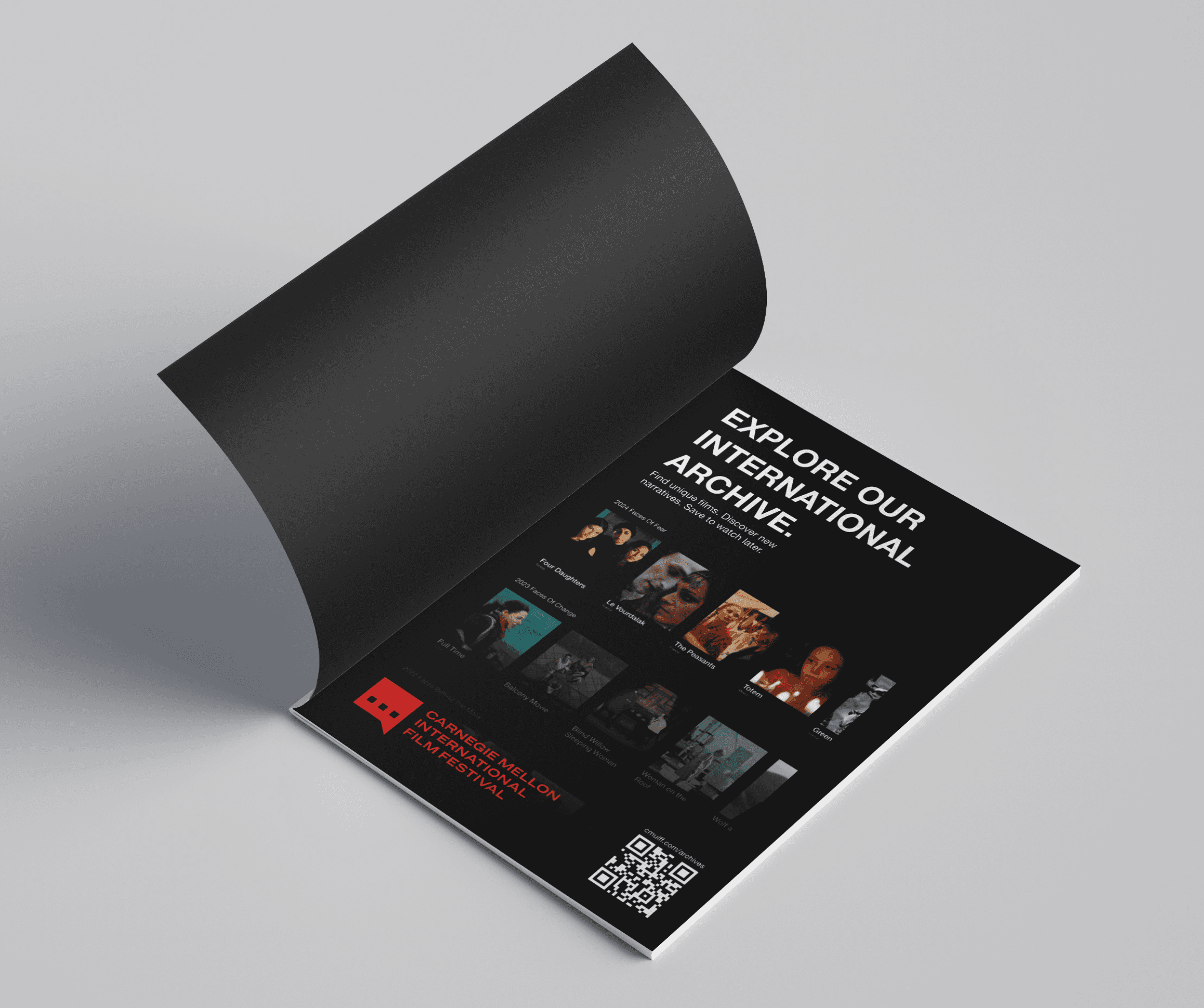
Pamphlet and ad graphic designs by Julianna Bolivar
Up Next
Clinical feedback mobile app for denists and faculty.
Enterprise Client Design
Medical Technology
Mobile

AI-enhanced networking for college students.
Conceptual
AI-Driven
Consumer-Facing


